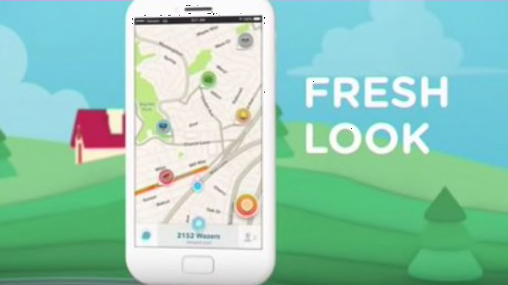
The best driving app that keeps on giving is ready to release it’s upgraded 4.0 interface.
The best driving app in the world that also happens to be free is ready to get even better. Earlier yesterday (Oct. 13, 2015) Waze dropped an official teaser video that heralds the coming of its newest 4.0 update. This update focuses mainly on user interface and aims to make the user experience a whole lot easier and enjoyable. Check out the official video below and let us know what you think about this new teaser down below in the comments.
"Waze 4.0 showcases a new, cleaner design for easier navigation, reporting and sharing. Steps to navigate have been minimized. The Waze map, menus and road reporting system are redesigned for higher visibility and clarity, including less clutter on the map, brighter buttons, and color-coded pins per report type. From head to toe, Waze has been revamped with a stronger focus on the driver and the social driving experience."

The 4.0 update has been in Beta testing for quite some time and some lucky early adopters are already reporting that we’ll enjoy what’s to come. Reddit user subconciousness commented that he’s, “…been using the beta for months now, it’s definitely nicer. Best feature is the ‘alerts reported ahead’ view where you can see all the upcoming alerts in a nice list.”
Some Waze fans are definitely upset that this newest update doesn’t include Android integration as Waze is iPhone only. But one insider does peg the Waze arrival on Android platforms coming as early as this December and Early 2016 with the announcement hingeing on RideWith (carpool app) doing their part in integrating with Waze.
